Client: J.P. Wisers
Goal: To redesign the website and digital store for J.P. Wisers, an iconic Canadian Rye Whiskey brand with a remarkable 165-year tradition.
Team: Completed during my tenure at Smith & Mason.
Involvement: UX Design, UI Design, prototyping, branding and layout.

• information architecture
• e-commerce
• ux & ui
• digital art direction
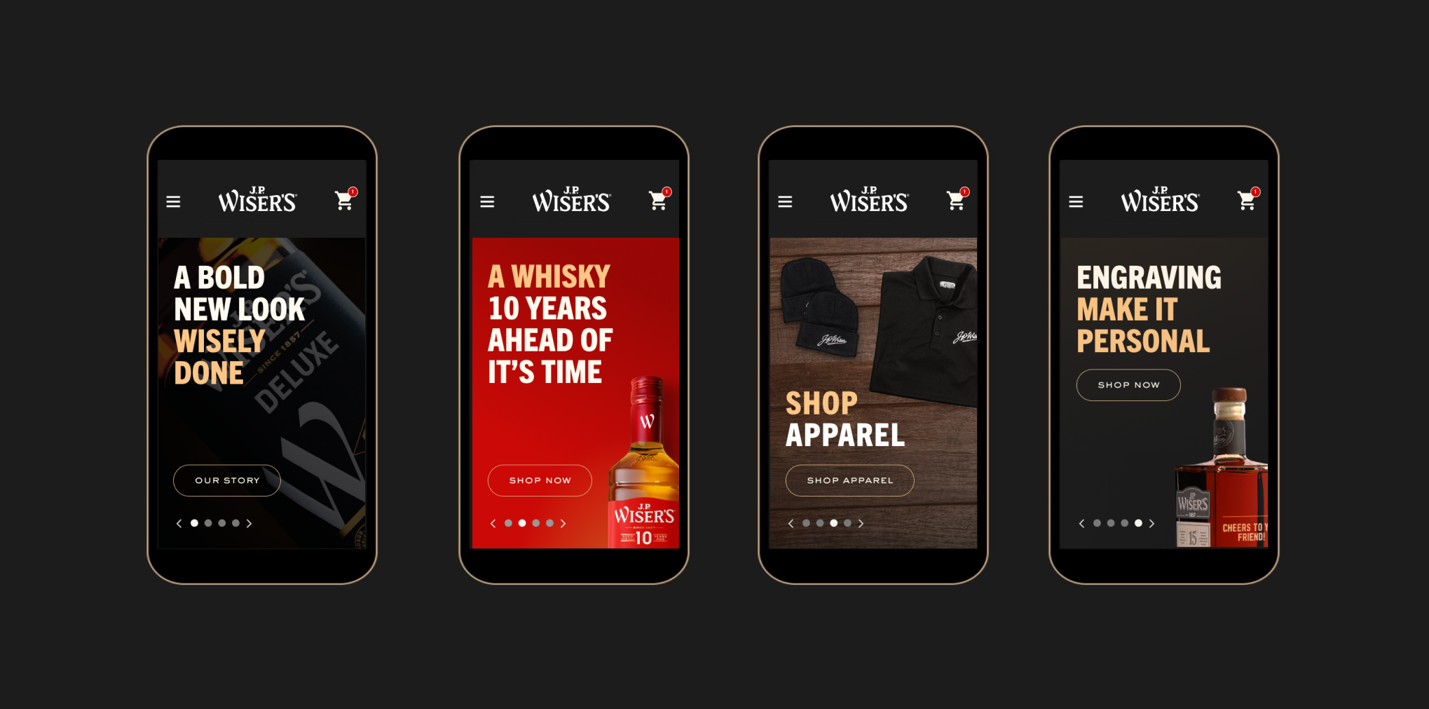
I've always been captivated by brands with rich histories. So when the opportunity arose to work with J.P. Wisers, I jumped on it.After a successful brand refresh, courtesy of JDO New York, J.P. Wisers hired us to revamp their online customer portal. The challenge posed by the J.P. Wisers team was clear — to restructure and redesign their site in a way that would be user-friendly, visually compelling, and in line with the new directives set by JDO.
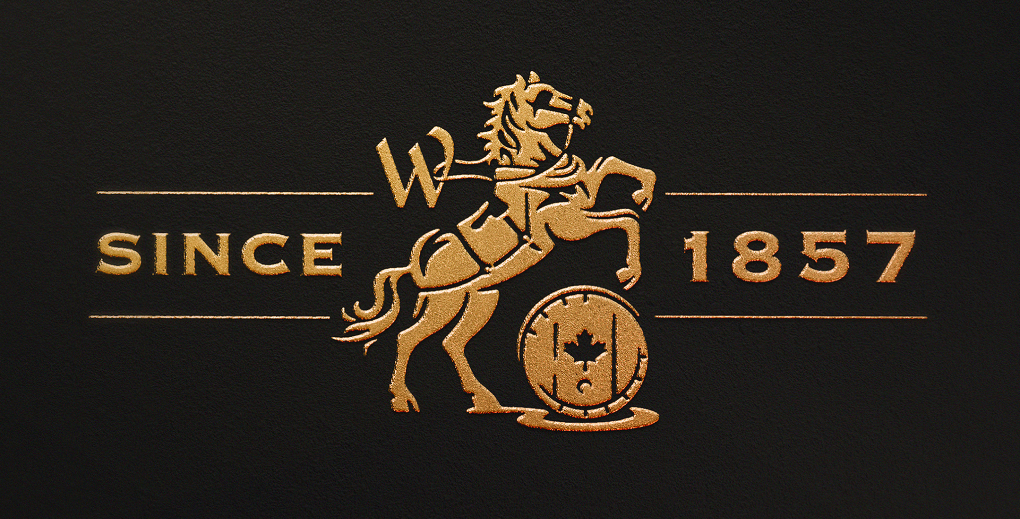
As is the case with many legacy brands, J.P. Wisers had taken on a dated appearance over time. The design refresh suggested by JDO New York was the outcome of a dedicated two year effort to rejuvenate the brand while honoring it's 165-year-old Canadian legacy.
Preserving the essence of this collaboration was paramount to our work. The industrial-era lettering, use of archival imagery, and incorporation of decorative emblems & crests in JDO's work crafted a compelling narrative for the brand.
DESIGN CONSIDERATIONS
First, the team at Smith & Mason conducted a full content audit, mapping out every aspect of J.P. Wisers existing online presence as of 2023.Next, informed by the findings from this audit, veteran UX designer @JoeSzabo set about creating wireframes and a site-map that would inform future design decisions.
Using this foundation, I created 7 visual directions.Armed with valuable feedback from the client, we dove into 3 rounds of visual design, creating 34 unique web pages in just 3 months, each meticulously crafted to elevate J.P. Wiser's digital narrative and streamline the customer experience.